
Current offers
A scrolling row of offer cards. Some are cream with a photo; some are plain red with copy only.
What makes it this section
With at least one offer card linked, this becomes the offers carousel. With none, it falls back to the handpicked-holidays row instead.
What a visitor sees
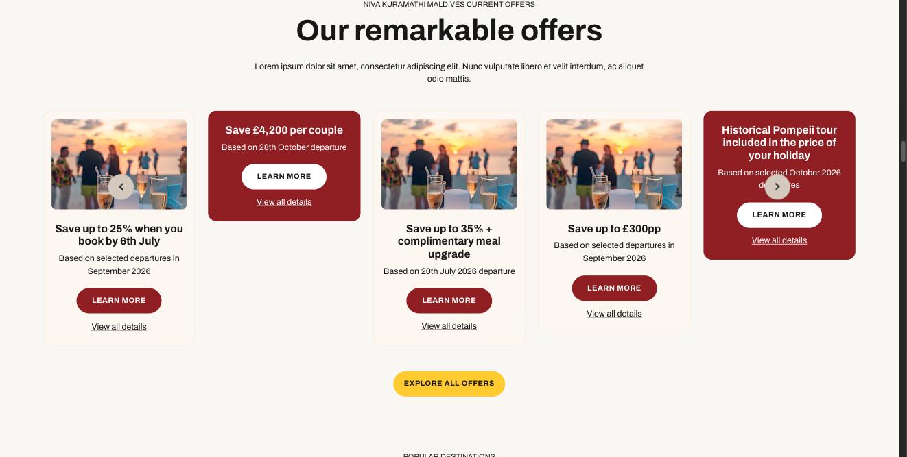
What each field controls
The Field column is the label as it appears in Contentful; under it, the field's id, for talking to a developer. The number matches the marker on the screenshots above.
| # | Field | What it controls | Notes |
|---|---|---|---|
1 | Internal name internalNamerequired | Nothing on the page. | How you find the entry again. Keep to the house pattern: "Homepage — …". |
2 | Eyebrow (small title above) eyebrow | The small upper-case line above the heading. | Leave empty and nothing shows. |
3 | Heading heading | The section's title. | — |
4 | Introduction introduction | The paragraph under the title. | Up to 600 characters. |
Section link label (optional) linkLabel | A plain link at the section level, e.g. "View all". | Hidden if the URL below is empty. | |
Section link URL (optional) linkUrl | Where that link goes. | — | |
5 | Layout variantrequired | How the row is arranged. | Carousel scrolls sideways. Grid wraps onto rows. Featured makes the first card bigger. Compact, Feature grid, List and Trust are the icon-row layouts and all need Card source set to iconItems. Choose one of: carousel grid featured compact featureGrid list trust |
6 | Card source sourcerequired | What goes in the row — and which section this becomes. | This is the most important dropdown on the form. Change it and you get a different-looking section with different card types. Pick manual to hand-pick cards; anything else fills the row from that family. Choose one of: manual hotels tripIdeas destinations rooms excursions articles offers handpicked tips experts testimonials linkCards iconItems feefo |
How items are chosen moderequired | Whether the order is yours or automatic. | manual = the order you drag the cards into. auto = ordered by the commercial priority set on each product. Choose one of: manual auto | |
Tags (for 'auto' mode) tags | Which items an automatic row picks up. | Free text, and NOT the approved tag list. To filter on approved tags use the Taxonomy panel on the right instead. | |
7 | Cards / selection (drag to reorder) cards | The cards themselves, and their order. | Which card types are allowed depends on Card source. A card left as a draft will not appear. |
8 | Link / CTA (optional) cta | The button under the row. | A link to a reusable Link / CTA entry — the wording and destination live there, so the same button can be used on several sections. Editing that entry changes every section pointing at it. |
Section background background | The band of colour behind the whole section. | none = white. Choose one of: none surfaceBase surfaceBaseDark brandYellowSoft | |
Heading level headingLevel | Nothing visible — the heading's importance for search engines. | Choose one of: h2 h3 h4 | |
Heading style headingVariant | How big the heading looks. | Separate from Heading level, so size and importance are independent. Choose one of: h2 h3 h4 h5 h6 subtitle1 subtitle2 | |
Heading colour headingColor | The heading's colour. | Choose one of: inherit primary secondary textPrimary textSecondary | |
Maximum cards maxCards | How many cards render. | Leave blank for no cap. Applies to automatic rows too. | |
Show this section showSection | Whether the section appears at all. | Set to No to hide the whole section without deleting it or unlinking it from the page. This is the safe way to take something down temporarily. |
Fields on each offer (Content card)
| # | Field | What it controls | Notes |
|---|---|---|---|
Title titlerequired | The offer headline. | — | |
Body body | The small print under it, e.g. "Based on selected departures". | — | |
Image image | The photo, on cream cards only. | — | |
Sale styling saleStyling | Switches the card to the flat red, copy-only style. | IMPORTANT: a card with no image is treated as a sale card whether or not you tick this. If you wanted a photo card and got a red one, the image is missing. | |
Button label + Link ctaLabel / link | The "Learn more" button. | You need both, or no button shows. | |
Details label + Details link detailsLabel / detailsLink | The "View all details" link under the button. | — |
Other entries this section needs
| Content type | Why you need it |
|---|---|
| Content card | One per offer, with Kind set to offer. |
How to change it, step by step
Find the entry
Search Contentful for "Homepage — Current offers" and open it. You can also reach it from the Homepage entry — it is in the Sections list, in page order.
Change what you need
Edit the fields listed above. Contentful saves as you type, but saving is not publishing.
Publish this entry
Change status → Publish, top right. Until you do, the site keeps showing the previous published version.
Publish anything new you linked
If you added a card or a CTA, open each one and publish it too. A draft card is skipped silently — the section renders without it and nothing tells you why.
Check the page
Open the home page. Changes appear within about 30 seconds. If nothing changed, the usual cause is an unpublished entry.